Seven social-ready image formats and the prompt for each
A cheat sheet of seven frame shapes for feeds, stories, thumbnails and banners: the ratio, what to put in the frame, and a prompt that fits.
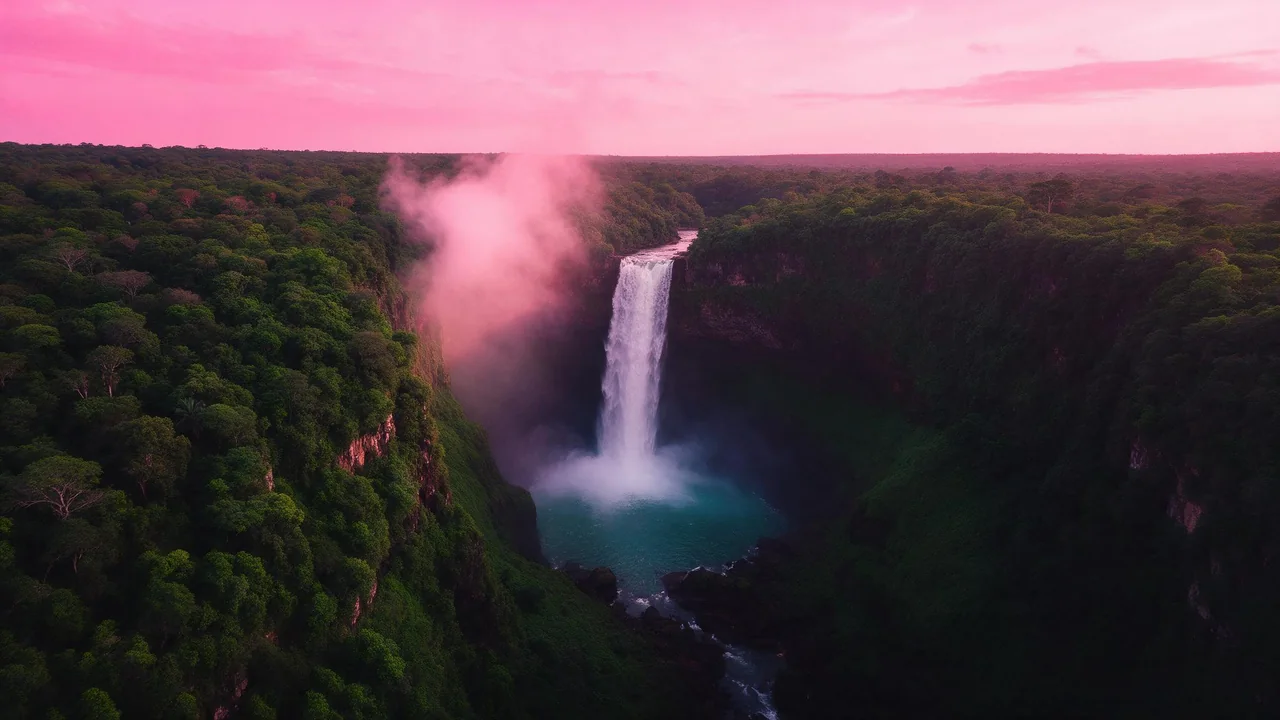
A picture that looks great in the studio can look wrong the second it lands in a feed: the head is cut off, the interesting bit is under a button, the thumbnail turns into a gray smudge. The fix is almost never a better prompt. It is picking the frame shape before you render.
Here are seven shapes, in the order you will probably need them. For each one: the ratio, what belongs in it, and a prompt you can paste and bend. A heads-up before the list: not every model offers every ratio. The model's form shows what it takes, and the notes below name a few that do.
1. The square post (1:1)
The friendliest shape: nothing gets cropped badly, and it sits well in a grid next to its neighbours. Put one clear subject in the middle and let the edges breathe.
A single ceramic mug of hot cocoa on a pink linen cloth, top-down view, soft window light, marshmallows melting, clean background, no text2. The tall feed post (4:5)
More vertical room means more screen for your picture. Stack your composition: subject in the lower two thirds, a bit of sky or wall above. Nano Banana 2.1 lists 4:5 among its ratios; faster, cheaper models often do not, so check before you plan around it.
A tall narrow bookshelf plant corner, a trailing green vine from a high pot down to a pink armchair, warm afternoon light, calm and cozy, no text3. The story and reel cover (9:16)
Full-height phone screens put app buttons on the top and bottom of your picture. Keep the subject in the middle third and leave the rest as calm texture: sky, wall, water, blur.
Vertical shot of a paper lantern floating up through a dusk-pink sky, soft clouds below, empty space at the top and bottom, dreamy, no text4. The video thumbnail (16:9)
Thumbnails are seen small, so they are won by contrast and one big shape, not by detail. Pick a bold subject, a simple background in a clashing color, and keep the busy parts away from the bottom right corner where the timestamp lands.
A huge glossy pink donut floating over a dark teal background, dramatic rim light, bold simple shapes, plenty of empty space on the left side, no text5. The carousel slide (3:4)
A carousel is a set, not a single. Fix the palette and the light in your prompt, change only the subject per slide, and the swipe will feel designed. Render the slides back to back so the style stays close.
Slide one of a plant care set: a small watering can on a pale pink table, flat soft light, muted green and blush palette, rounded friendly shapes, no text6. The profile tile (1:1, but different)
Profile pictures get cropped to a circle, so corners vanish. Ask for a centered subject with a plain background and keep the detail inside the middle of the frame.
A friendly cartoon cloud mascot with a tiny smile, centered, flat pink background, thick soft outline, simple shapes, no text7. The banner (21:9 or wider)
Banners are mostly empty on purpose: the platform covers a chunk of them with your avatar and buttons. Ask for a long horizon, a gradient or a row of small objects. Nano Banana 2.1 lists 21:9 and wider ratios, so it is a safe place to start.
Wide panorama of a pastel sunrise over soft pink clouds, the lower third calm and empty, painterly, no textA word on words
Image models are not great at long text, and tiny text is where they fail first. Render the picture without words, add the title in your usual editor, and you will never get a misspelled headline. If you need a short word in the picture itself, a typography-minded model such as Ideogram v4.5 is the one to try, and even then keep it to a handful of letters.
What this cheat sheet cannot promise
Platforms change their crops and overlays without telling anyone, so the safe zones above are habits, not rules. Check your first post on a real phone before you batch a month of them. For quick drafts at any of these shapes, Recraft V4.1 Flash lists a few common ratios, and the full list of models shows what each one accepts. If you want a daily routine around all this, start with the ten-minute habit.
Questions
Which ratio should I use if I only pick one?
A vertical one. Most people see feeds on a phone, and a 4:5 or 9:16 picture fills more of the screen than a square.
Can I render once and crop to every shape?
Mostly. Keep the subject in the center third and the edges simple, then crop in your editor. Very tall and very wide crops of the same picture rarely both work, so render those separately.
Why does my text come out garbled?
Small text is the hardest thing for an image model. Render without words and add the text afterward, or use a typography-minded model for a few big letters.