A matching profile picture, banner and highlight covers for your social account
Build one look across a profile picture, a banner and a row of highlight covers: one palette, safe areas, a crop check on a real phone, and a name for the set.
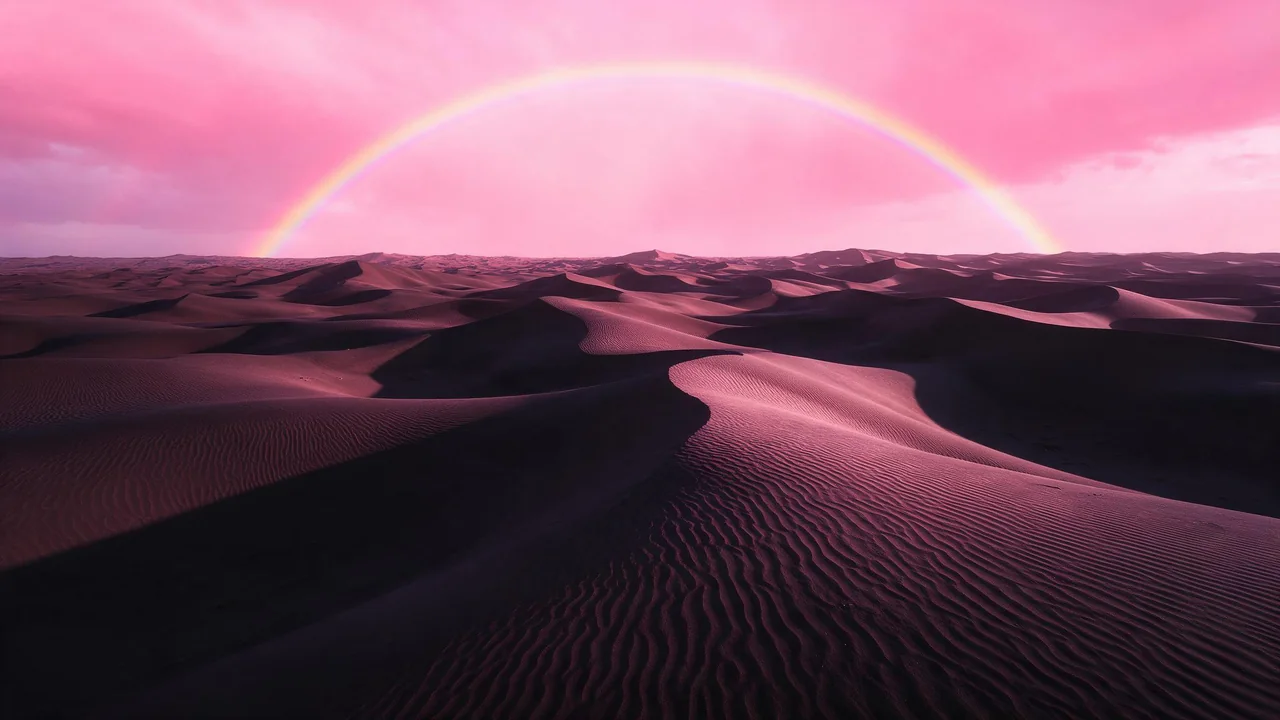
Open any account that looks professional and count the pictures: a round profile photo, a wide banner, a row of little circles under the bio. Three formats, three crops, and yet it reads as one thing. That is not luck. Someone decided on a look first and then cut it three ways.
Most of us do it the other way round. We make a nice avatar in March, a banner in June because the empty strip started to bother us, and covers whenever a highlight needed an icon. Each one is fine alone. Together they look like three different accounts. Here is how to make them once, as a set, in one sitting.
Pick three things before you render anything
A set is held together by decisions, not by prompts. Write these down in a note, in plain words, and paste them into every prompt you write afterwards:
- One palette. Two main colors and one accent. For example blush pink, deep plum and a warm cream. Name them in words the model understands, not in codes.
- One kind of light. Soft window light, hard studio flash, glowing dusk. Mixed lighting is the quickest way to make pictures from the same hand look unrelated.
- One recurring shape. A sphere, a leaf, a cloud, a thin horizon line. It shows up in all three formats, big in one and tiny in another, and that echo is what the eye reads as a family.
Everything below is built on those three lines. If you change one halfway through, start the set again; patching never looks as good as a clean run.
Start with the banner, not the avatar
The banner is the largest canvas and the most forgiving one, so it sets the look. Render it first and the other two can borrow from it. Ask for a long, calm scene with the recurring shape somewhere that is not the middle, because the platform will put your profile picture over part of it and buttons over another part.
Wide panorama, a soft pink horizon line across the whole frame, deep plum sky fading to cream near the ground, one glossy sphere resting on the horizon at the far right, soft dusk light, calm empty space everywhere else, smooth and minimal, no text, no peopleP-Image is a sensible place to try several banners cheaply. Not every model offers every wide ratio, so check the form of the model you picked before planning around a shape.
Cut the profile picture from the same world
Avatars are shown as a small circle, so detail is wasted and corners disappear. The trick is to keep the banner's palette and light and shrink the idea down to one centered subject. Reuse the exact words of your three decisions.
A single glossy pink sphere, centered, on a plain deep plum background, soft dusk light from the upper left, a thin cream rim, simple smooth shapes, plenty of empty margin around it, no textIf you already have an avatar you love, go the other direction: give it to an edit model such as Nano Banana 2.1 Edit and ask for a banner background that continues its colors. The result is looser than rendering from words, but it keeps your existing picture exactly as it is.
Make the highlight covers a family of tiny versions
Covers are the smallest of the three and the most often seen in a row, which means they must be told apart at a glance and still look like siblings. Keep the background and light identical and let only the subject change, one simple object per topic: a sphere with a leaf for plants, a sphere with a tiny mug for coffee.
- Render the first cover with your three decisions and a short, concrete subject.
- For every other cover, keep every word after the subject and swap only the subject.
- Render them back to back, so the style stays close between runs.
- Look at the whole row at once. If one cover jumps out for brightness, regenerate that one, not the set.
Safe areas: plan for what gets covered
Each format loses a different part of the picture. The avatar loses its corners. The banner loses a patch to the profile picture, often on one side, and may be cropped differently on a phone than on a desktop. Covers lose their corners too and are shown very small. Platforms change these crops and their sizes without warning, so check the platform's current help page for the numbers rather than trusting a table from a blog, including this one.
- Centered subject, quiet corners for the avatar and the covers.
- Subject away from the profile picture's spot on the banner, with calm texture in the middle and lower areas.
- No words in the picture. Text near an edge is the first thing to be cut. If you need a name or a tagline, add it in your editor where you can move it.
The crop check, on a real phone
Do this before you tell anyone the account is done. Upload the three pictures, then open the profile on your own phone and, if you can, on a desktop browser. Look for four things: is the sphere on the banner still visible and not under the avatar; does the avatar circle show the subject whole; are the covers readable in a row; does the set read as one at arm's length. Fix the one that fails. A re-render of a single picture is quick.
Then look at the profile in the other color mode if the platform has one. A dark plum banner that looks rich in a light theme can sink into a dark one.
Name the set so you can remake it
In three months you will want a new cover, and you will have forgotten the prompt. Give the set a short name and keep one file with it: the three decisions, the avatar prompt, the banner prompt and the cover prompt with its swap slot. Save the pictures with matching names too, such as plum-dusk-avatar, plum-dusk-banner and plum-dusk-cover-plants. When it is time for a seasonal refresh, the same note works, and the autumn refresh walkthrough shows how to turn existing pictures into a new season without starting over.
What this cannot do for you
The studio renders pictures. It does not crop them to a platform's profile shapes, preview how an account will look, or keep a set together for you; that is your note and your eyes. Models also drift a little between runs, so expect to regenerate a cover or two. For the table of frame shapes and their uses, see seven social-ready image formats, and for a way to keep this kind of work going in small daily sessions, the ten-minute habit. All 2 image models are listed on the models page, and the studio is where the first banner gets made.
Questions
Which should I make first, the profile picture or the banner?
The banner. It is the biggest canvas and sets the palette and light, and the avatar and covers can then be made from the same words at a smaller scale.
Do the three pictures need the same subject?
No, they need the same palette, light and one recurring shape. The same sphere can be big on the banner, centered on the avatar and tiny on a cover.
How do I know the crops will work?
Upload and look on a real phone. Platforms change their crops and sizes, so no table is a guarantee; the live profile is the only honest test.